Deca, 2021 → 2022
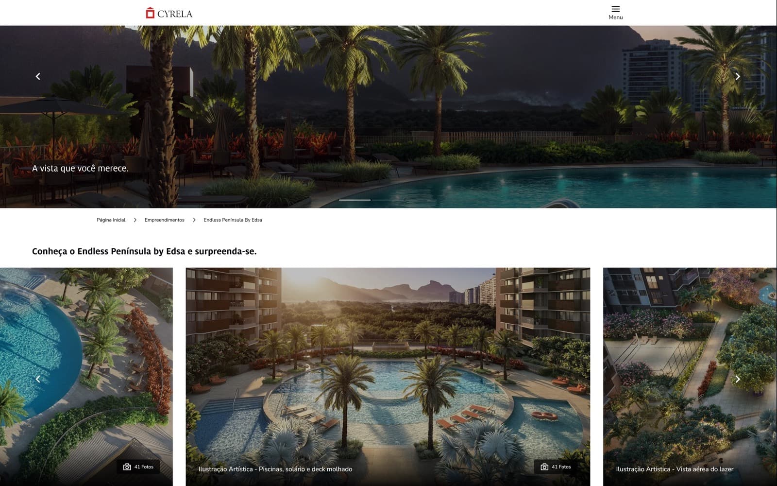
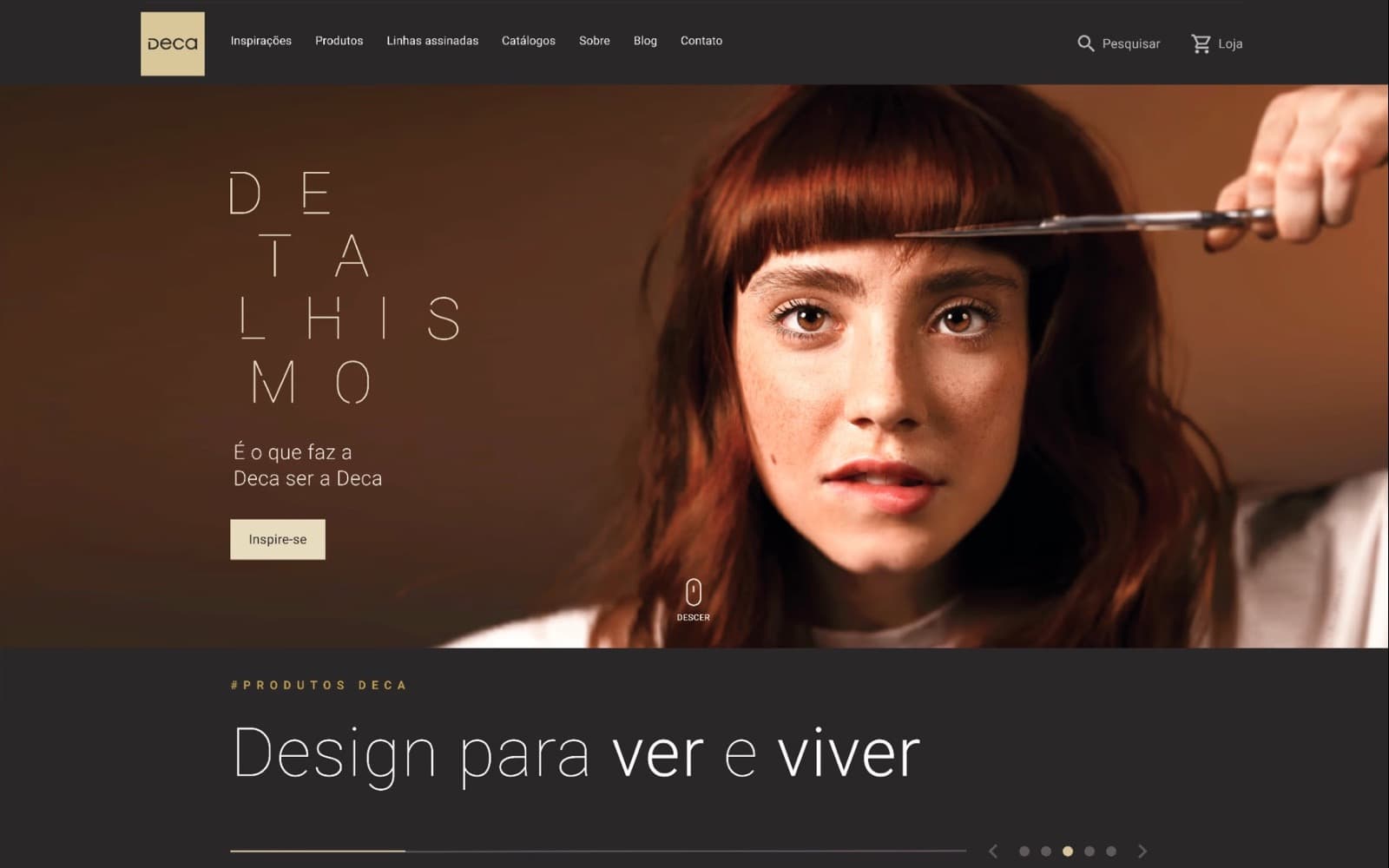
A new product-tree architecture and a visual identity aligned to Deca’s rebrand.
- Role
- Product Designer / Design Team Lead
- Sector
- Construction
- Timeline
- 16 months
- Platform
- Web
The decision that mattered most
Architects and people renovating their homes came to Deca to choose products, but the site was organised around internal product lines and most visitors never scrolled past the banner. We rebuilt the product tree around rooms, turned search into the main way in and created a visual identity aligned to the brand's rebrand. User retention grew 42%.
Deca, a Dexco brand, is a key name in Brazil’s metal and sanitary ware sector. Its website had to serve architects planning projects and homeowners planning a renovation, and discovery showed it was serving neither well.
- Most visitors never scrolled past the first fold, and many clicked the banner expecting it to lead somewhere.
- Search was the most clicked item in the menu, yet the catalogue followed internal product lines.
- Technical specs, finishes and available colours were hard to find and compare across products.
- The site felt impersonal: signature collections and product technology, Deca's real differentiators, were buried.
01
Make products easy to find
Navigation, filters and search organised around how people look for products: by room and by need.
02
Show what a project needs
Technical specs, measurements, finishes and colours clear enough for precise planning.
03
Fit the professional workflow
Support architects from inspiration to specification, across devices.
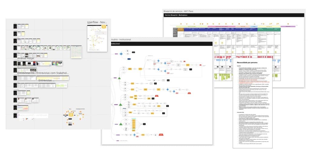
We interviewed 11 people, 3 architects and 8 homeowners who had renovated, alongside stakeholders. Nobody started from Deca's catalogue structure: they started from a room and a need. Analytics agreed, with search as the most clicked menu item.
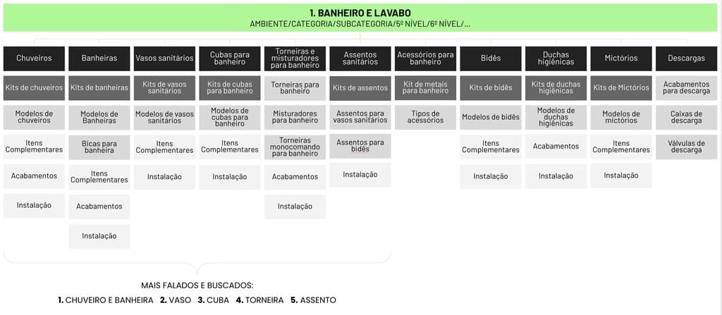
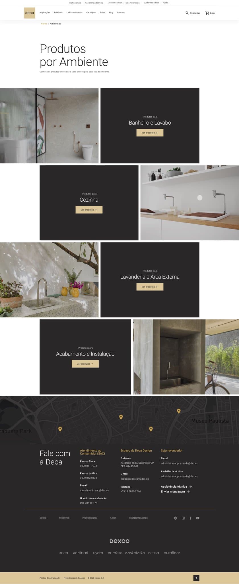
We mapped the whole sitemap and redrew the product tree as room, category and subcategory, starting with bathrooms, where the most searched products lived: showers, toilets, basins, taps and seats.
The new tree became the base for navigation, filters and search, and was validated in usability tests before we moved to high fidelity.
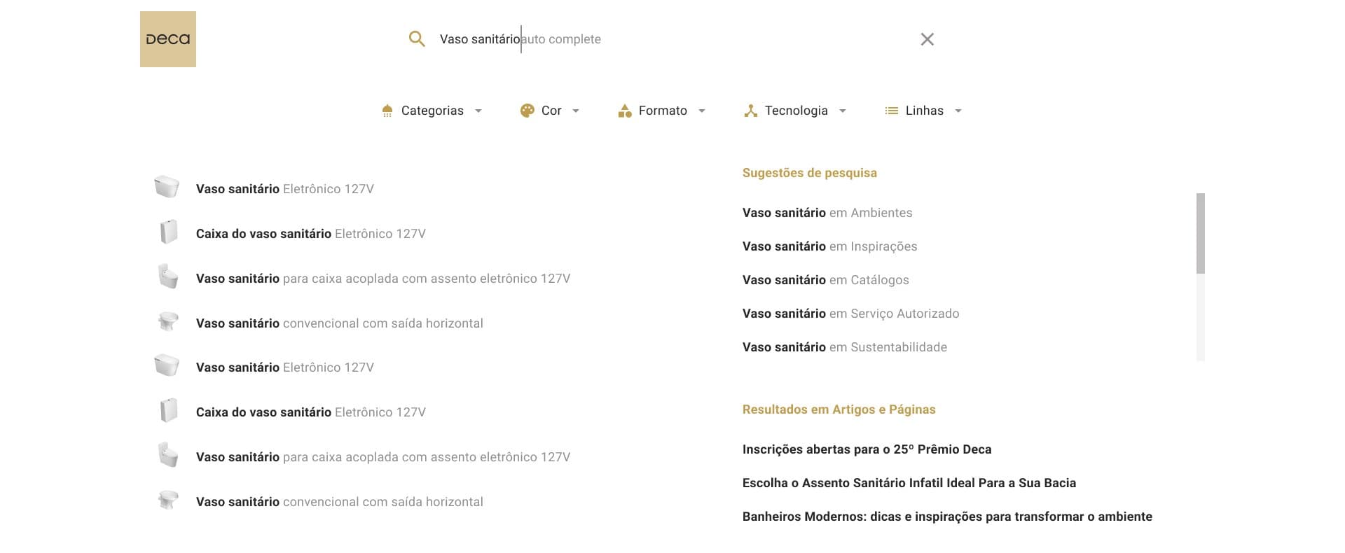
Search was already where people went first, but it returned a flat list that mixed products and content with no way to narrow it down.
We redesigned it to suggest products while people type, separate products from inspiration and articles, and filter by category, colour, format, technology and product line, the attributes architects use to specify.
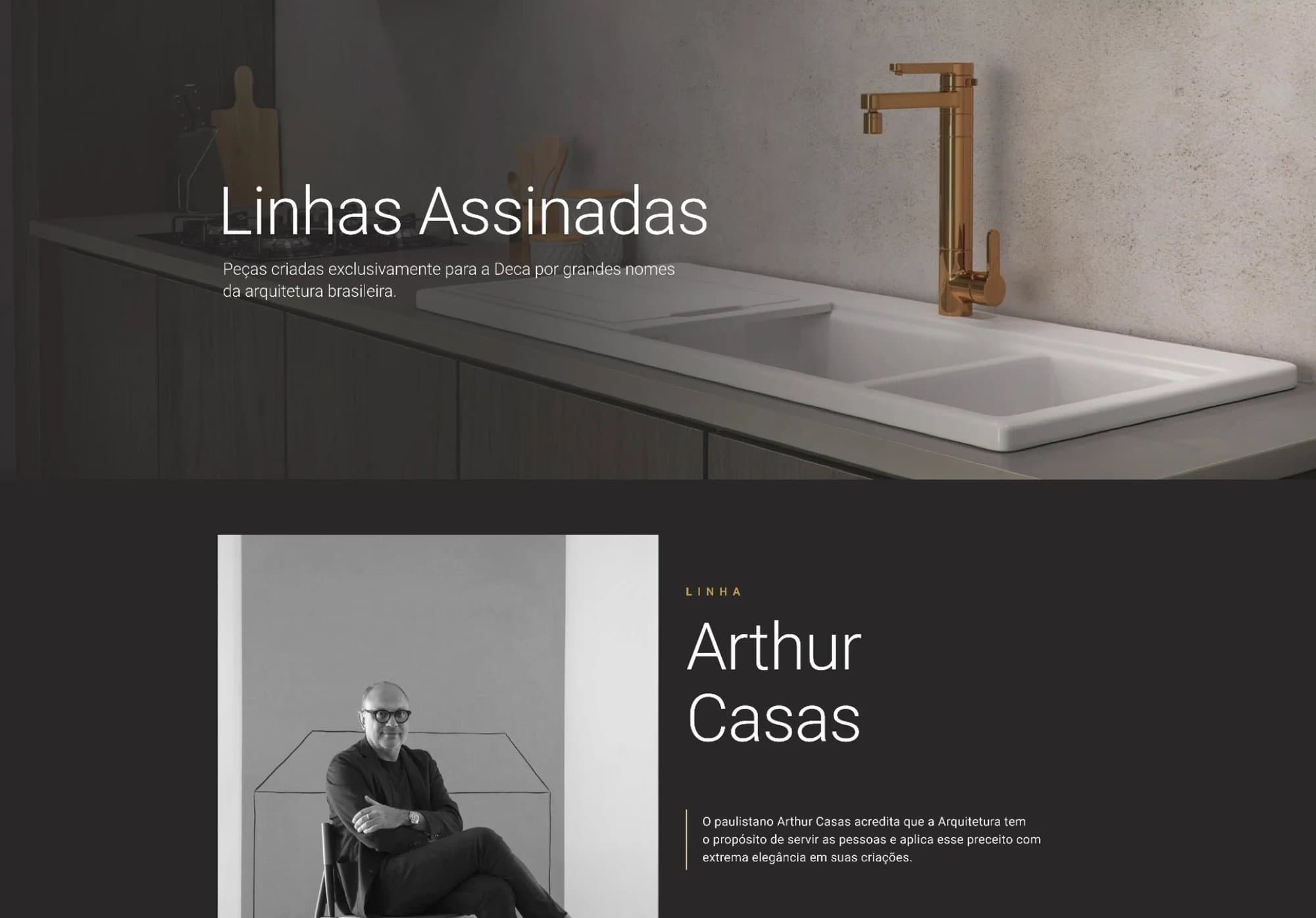
The heuristic evaluation found the site impersonal, and interviews showed aesthetics and function weigh most in the choice. Deca's strongest arguments were hidden deep in the site.
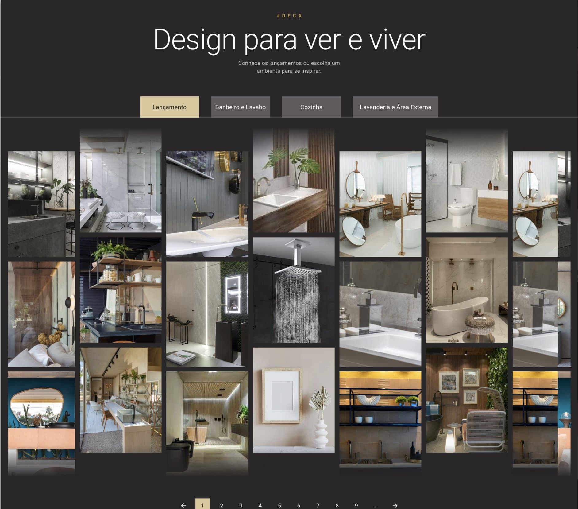
We brought signature collections forward with the name and portrait of the designer behind each one, showed available finishes on every collection, and explained product technology with direct, visual content that needs no technical background.
+42%
User retention
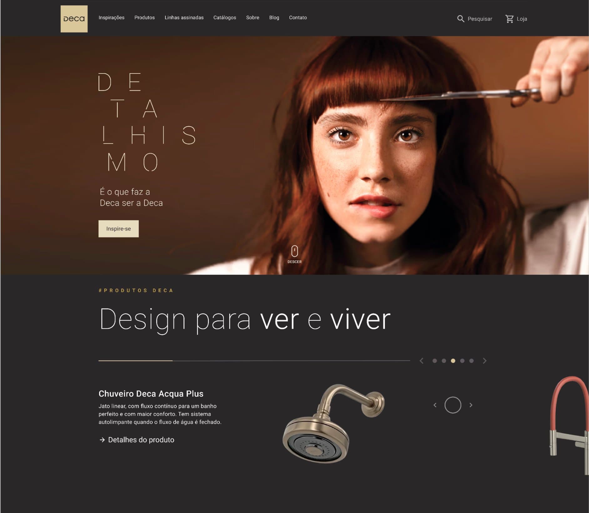
With a new visual identity aligned to Deca's rebrand and a redesigned product tree, user retention grew 42%. After handoff we followed the build through design QA and defined the KPIs to keep evolving the platform.

The next challenge is carrying the same visual consistency to the other Dexco brand portals, such as Portinari, Hydra and Ceusa, so architects and homeowners find the same clarity whichever brand they start from.